
Responsive typography with Modular Scale: Create meaningful proportions in your design using SASS
This article is part 2 of a series on responsive design and typography systems. Read part one and part three.
In our previous article, we explored the use of REMs and media queries to implement a scalable typographic foundation using fluid typography.
With the techniques of scalable type under our belt, we’re going to take a look at an open source sass design tool that takes the guesswork out of setting beautiful sizes for your design elements — Modular Scale.
Proportion and the Modular Scale
With all of our sizes set in REMs, it becomes difficult to pick the size of elements. For example, at how many REMs should we set the font-size of h1 or h2 be, if p is anchored at 1rem?
It’s tempting to adjust the REM size of individual elements and spend your time bringing your design into balance by eye — that’s how designers tend to work in tools like Photoshop or Illustrator. But no matter how well trained your eye, certain proportions between sizes, ones that occur frequently in nature, in music, and in simple geometric shapes, are naturally pleasing and accordingly have been employed in art and design for centuries.
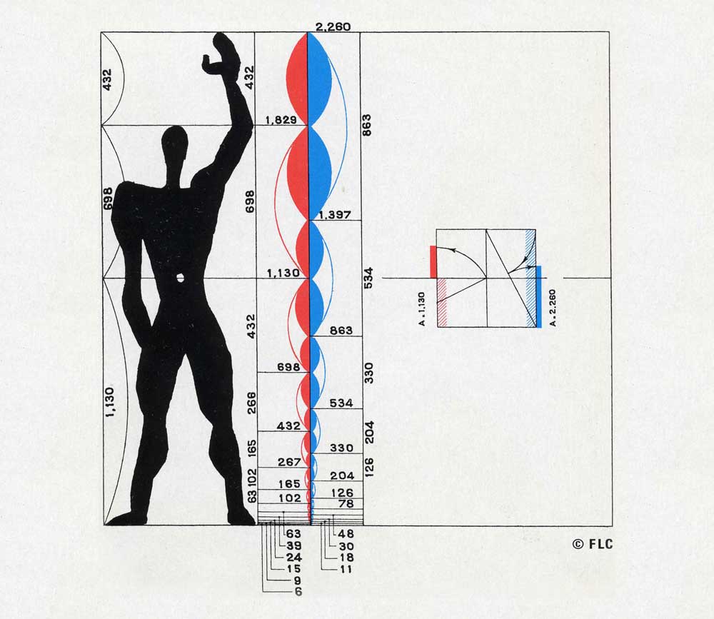
In modern design, Le Corbusier’s Modulor, based on the golden ratio and the proportions of the human body, is the most famous of such modular scales, used extensively in his architecture and adopted by many other designers.
Sass’s ability to do math enables us to calculate these visually pleasing relationships between our type sizes directly in our stylesheets. Let’s take a look at how we can effortlessly size our type using sass and Modular Scale.
Generating modular scales
Your first step after installing modular scale is to declare a base size and scaling ratio as global sass variables. A number of classic design ratios are included for your convenience. Here I’m baselining my scale at 1rem, which we’ll use to set our body text, and incrementing the values of my scale using the golden ratio. This creates a Fibonacci series where each value on the scale is equal to the sum of the two preceding values.
$ms-base: 1rem;
$ms-ratio: $golden;  // 1.618
After declaring your base size and scaling ratio, accessing values on the scale is as simple as calling the ms() function.
ms(0);  //  1.000rem - $ms-base
ms(1);  //  1.618rem
ms(2);  //  2.618rem
ms(3);  //  4.236rem
ms(4);  //  6.854rem
ms(5);  // 11.090rem
Next, let’s map these values to the font-size of our body text and headers.
body{ font-size: ms(0); }
  h5{ font-size: ms(1); }
  h4{ font-size: ms(2); }
  h3{ font-size: ms(3); }
  h2{ font-size: ms(4); }
  h1{ font-size: ms(5); }
Tuning your scale
To create a more versatile series, one viable option is to decrease the ratio between each step on the scale. We designed the Bugsnag dashboard with a $ms-base of 1rem and a $ms-ratio of $major-third or 1.25, creating much less contrast between steps on the scale. Another approach is to interleave two modular scales, ones with a unique $ms-base and a shared $ms-ratio, to create a double stranded modular scale. This is the approach used to create Le Corbusier’s Modulor and it’s as useful in typography as it is in architecture.
$ms-base: 1rem 1.25rem;     // Double stranded modular scale
$ms-ratio: golden;
ms(0)   // 1.000rem
ms(1)   // 1.250rem
ms(2)   // 1.618rem
ms(3)   // 2.023rem
ms(4)   // 2.618rem
ms(5)   // 3.273rem
Now that you’ve mapped the font-size of text elements to your modular scale, begin experimenting with your $ms-base and $ms-ratio to find a scale that’s appropriate for your content.
Next steps: Coordinating breakpoints with SASS
With control over absolute size of design elements via REM sizing and control over the relative size of design elements via Modular Scale, our next challenge is to coordinate changes in scale with changes in layout across our design’s most important breakpoints. With so many moving parts, sass is essential to keeping your media queries clean and organized. I’ll show you how in my next post.